Multi-Button/Indicator
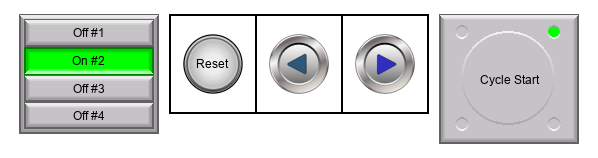
Control multiple buttons or actions at the same time.
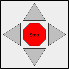
 Example:
A radio button control has several buttons and you can only select one at a time. Create a Jog keypad where you can press any arrow key to select a bit and deselect any other bit.
Features
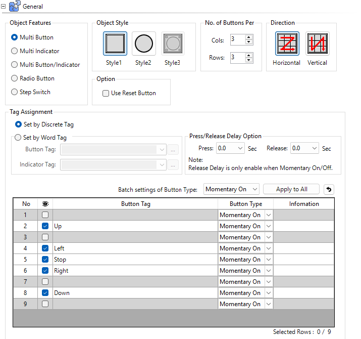
Specify the multi-button control behavior.
-
Multi-button: a group of buttons
-
Multi-indicator: a group of indicator lights
Multi-button/Indicator: a group of buttons with a different write tag to the button operation which displays status.
Example:
You may have a safety gate run button but you want the button to indicate only when the machine is running and the gate is in a safe position.
-
Radio Button: similar to a multi-button, but only one button in the group is activate at a time.
-
Step Switch: any button press deactivates the current button, and activates the next button in sequence, up to four outputs per cycle.
Object Style
-
Style 1: square frame
-
Style 2: round frame
-
Style 3: available only for Step Switch
No. of Buttons Per
Create a grid with a specific number of rows and columns to contain buttons. The Visibility tick box controls actual button number.
Direction
Buttons appear in sequence left to right or top to bottom.
Reset Button Option
Adds a reset button in the first button group position and removes the last button in the group. Press Reset to clear all other buttons in this group.
Assign Tags
Discrete Tag
Select a tag for each button in the group and set the button type.
Word Tag
The number of bits in a tag determines the number of buttons. A button list updates individual bits in a word tag.
Example:
When you press the second button in group, bit 1 activates. In the PLC, that word reads “2” in decimal format. If fewer buttons exist than bits in the word, the higher bits always read 0.

Button Type
You can assign different operations to each multi-button and multi-button indicator:
Toggle
Operates between ON and OFF with each selection.
Momentary On
Turns the button tag on when you press it. When you release the button, the button tag turns off.
| Note: | You cannot use Passwords with this type. |
Momentary Off
Turns the button tag off when you press it. When you release the button, the button tag turns on.
| Note: | You cannot use Passwords with this type |
Set On
Turns the button tag on but not off. Use a separate device, such as another button or controller (PLC), to turn the tag off.
Set Off
Turns the button tag off but not on. Use a separate device, such as another button or controller (PLC), to turn the tag on.
General Timing Chart
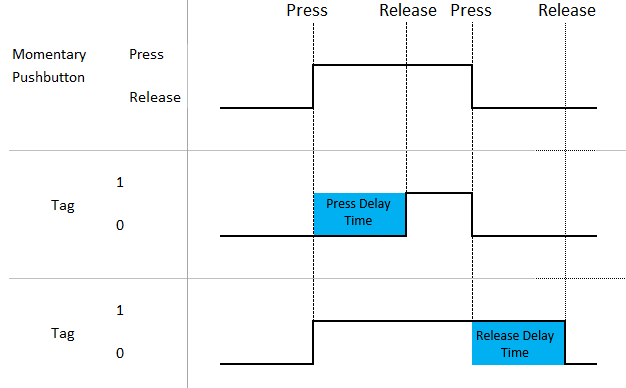
| Note: | The timing chart is for reference only and shows the general object operation. It does not consider communication timing delays associated with external devices. |
Press Delay/Release Delay
Press and Release Delay is available for certain objects.
When you press a button, there is a delay before the tag activates.
— or —
When you press the button, there is a delay before the tag deactivates.
Example:
If you want an operator to hold a button press for at least 0.5s to prevent accidental presses, add a press delay or add a 0.5s release delay so it stays on for at least 0.5s, ensuring the PLC sees the button press event.
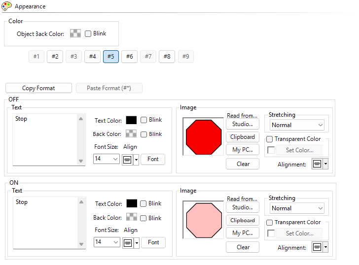
Appearance

Button Selector
You can add On and Off state text and images to object buttons/indicators. The selector allows you to select which button to configure.
You cannot use images with Style 4.
Copy Format
You can configure a button, then select Copy Format to save the following settings:
• Back Color
• Font Size/Style
• Alignment
• Blink settings
Paste Format
Select a button and click paste Format to assign copy format settings to other buttons. The original button has a yellow background in the button selector.
Image
You can specify a custom image for each button.
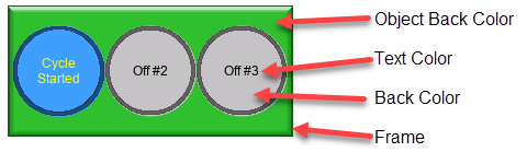
If you use custom images from your PC or Graphic Studio®®, they layer with text, background colors, and frames. You receive a prompt to turn these off if show only the image.
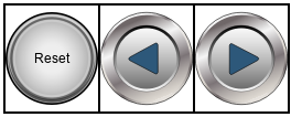
If you layer images or shapes, you can press a button through another image. If there are two buttons on top of each other, only the top button actuates.
For more information, see C-more Graphic Studio®® and Common Object Settings.
Behavior
For information, see Common Object Settings.
Password
For more information, see Password.
CM298