Common Object Settings
These settings are common to most objects.
For specific settings, see the help topic for each object.
Top Bar

-
Name: gives the object a unique name for quick identification in the Object Layer List, Tag Cross Reference, Project Print Out, and Simulate. The default object name is the object type followed by a number. The number increases with each new object you add to the screen.
 Example:
BtnInd1, BtnInd
-
Text Style: object text areas can contain up to nine different settings for language and font. Click the drop-down arrow to make changes. The setting affects all text areas in the object configuration.
See Language to learn more.
-
Lock: once you configure and position an object, tick the box beside Lock to prevent accidental changes.
Side Bar
-
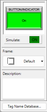
Object Preview Window: view settings without closing and opening the configuration window.
-
Simulate: test object appearance in different states. You can click the ON or OFF box or enter a value to see the object in action.
-
Frame: most objects can display with or without a frame.
-
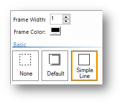
Choose from 19 frames or select None to have no frame.
-
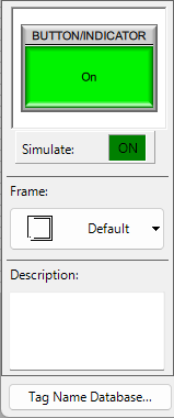
Select Default to use the frame style configured on the Setup/Panel Manager configuration screen. Objects configured as Default update each time the default setting changes.
-
Simple Line: choose a Frame Width and color.
-
Description: help other users understand your configuration, up to 400 characters.
-
Tag Name Database: a shortcut to the Tag Name Database with the configuration window open.
Label and Font Configuration

At the top of each object configuration window is an expand button that opens the Object Label settings.
Label
Shows the object label.
Text
-
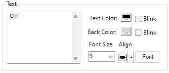
Blink: alternate text or background colors. C-more automatically chooses the alternate color.
-
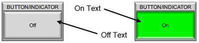
Off Text/On Text: text to show on discrete objects such as buttons and indicators, depending on the tag state.
-
Text Fields (Label, On Text, Off Text): text up to 40 characters and multiple lines.
| Note: | Line breaks count as two characters. |
-
Font Size: depends on font type. For all fonts except Classic, the minimum and maximum text sizes are 8 to 72. If you need larger or smaller text, type the size.
-
Align: choose text alignment in the text area:
-
Horizontal alignment: left, right, or center
-
Vertical alignment: top, bottom, or middle
Font
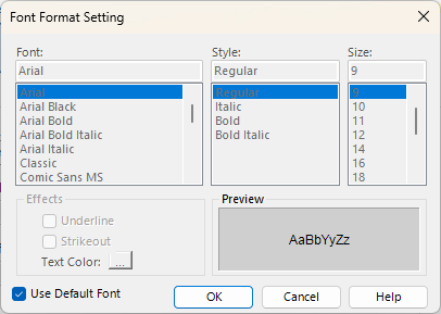
The Font button opens Font Format Setting. Select text font family, style, and size.
-
Use Default Font: tick the box beside to apply the font settings configured in the Language section of the Function tab. This setting is enabled by default.
Position
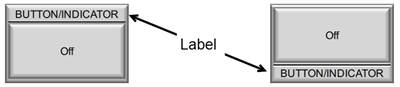
Choose the label location: top or bottom.
Color
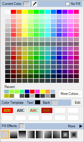
Click the color box to choose background and text colors.
Color Template
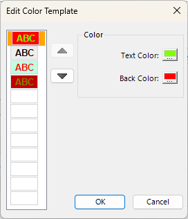
Click the Edit button to choose a color template to combine text and background colors.
Fill Effects
Select from gradients and patterns for the background color.
Object Mode
Most objects require an assigned tag to connect other objects and the controller.
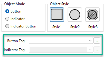
Tag (Button, Indicator, or Indicator Button above): click the down arrow to see a list of tags compatible with the object.
Click the Browser button  to open the project Tag Name Database, filtered for the acceptable data types. You can select a tag, add, or edit a tag. To learn more see Tag Name Database.
You can also type in a tag name. When you click outside the tag field, if the tag does not already exist, the Add Tag window opens and you can create the tag.
Image
You can change default images in many objects.
Supported image formats are:
-
BMP
-
JPG
-
PNG
-
SVG
Add images in one of these ways:
-
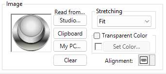
Studio: add images from the C-more Graphic Studio®®
-
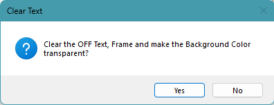
Select Yes to remove the frame, text, and background, leaving only the image.
-
Clipboard: paste an image from your PC clipboard
-
My PC: select an image from a local or remote drive
Stretching
-
Fit: maintains the graphic aspect ratio and fits the image in the object frame.
-
Stretch: stretches the graphic to fit the frame. This may distort the original object shape.
-
Normal: graphic aspect ratio is maintained, but the object is not bound by the frame. It displays in its original size. The frame may cut off the object.
Transparent Color
Sets a transparent color for the image that is not visible on the screen, which does not cover objects underneath. Use this to remove backgrounds or combine objects.
To set a transparent color:
-
Tick the box beside Transparent Color.
-
Select the Set Color button.
-
The Select Transparent Color window opens displaying the object image.
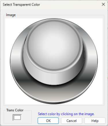
When you click a color (such as the white background), the Trans Color box in the lower left corner of the window changes to match. If you click the wrong color, click another color to make it transparent. The Trans Color changes to match.
| Note: | The color you choose is transparent everywhere in the graphic, not just the current location. If you click on a white background to make it transparent, if you use white anywhere else in the object, it is transparent also. If possible, use a unique background color for transparency. |
Alignment
For graphics set to normal stretching, choose image alignment:
-
Horizontal alignment: left, right, or center
-
Vertical alignment: top, bottom, or middle
CM116