Circle

The Circle object is a basic shape that can be a circle, pie, or chord and any of these can be an ellipse. You can customize a circle object with various colors, patterns, outlines, and text, as well as visibility control and animation.
Appearance
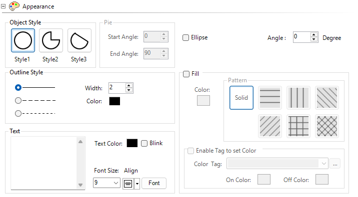
Object Styles
Style 1: Circle
A standard filled or outlined circle shape.
Style 2: Pie
Adjust the start and end angles for the pie section of the circle.
Grab the yellow handles and drag
— or —
enter the start and end angle in the object configuration dialog.
-
0 degrees is straight up, and the angle increases clockwise.
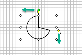
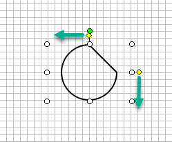
Style 3: Chord
Grab the yellow handles and drag
— or —
enter the start and end angle in the object configuration dialog.
-
0 degrees is straight up, and the angle increases clockwise.
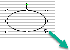
Ellipse
Drag the corners of the object to adjust the object aspect ratio.
Size
Drag the corners of the object to adjust the object size.
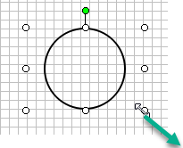
Angle
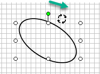
Grab the rotate handle and drag to adjust the rotation angle on the screen or set the rotation. Adjust angle ±360°. Default is 0°.
The angle you configure is offset from the object position on the screen. This angle is the start angle for any rotation animation.
Outline Style
Click to select the object line border style: solid, broken line, or dashed.
Fill
Fill to fill the circle object with color.
-
Tick the box.
-
Click Color and select the color.
Enable Tag to Set Color
Tick the box beside Enable Tag to Set Color to allow a discrete tag to control the on and off fill colors. Select the fill colors. Enable Tag to Set Color overrides the default line color selection.
Text
Enter text to display in the circle with the available fonts and sizes.
Behavior and Animation
For more information, see Behavior and Animation.
 Related Topics
CM078